

When we're starting out with our brands, we want to create something that we'll absolutely love and be proud of, but also something that shows we mean business and that people can trust us.
But when choosing a color palette or fonts, there are common mistakes people make that can influence how their audience feels about their brand.
So let’s dive into what you need to focus on to choose the right color palette and fonts and what not to do so you don’t make the same mistakes.
If you’re not sure how many colors to choose, it’s usually good to go for a number between 5-8.
Now, let's look at this color combination:

It's a super colorful, fun color palette.
Here's the problem: if someone is using their phone at 100% brightness (I don't know why they would, but let's just imagine that), their eyes will hurt for a second. These kinds of colors together are overwhelming.
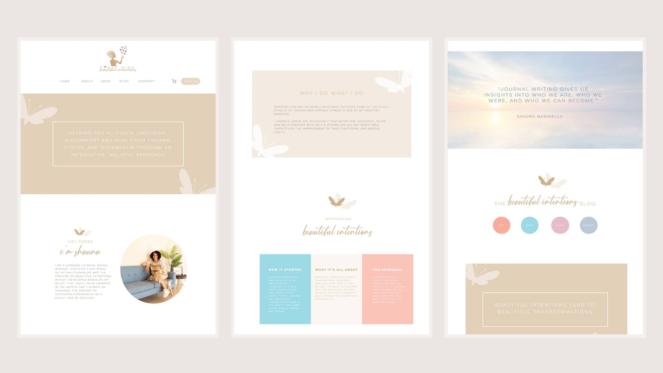
These are the colors that people often use throughout their website. So for example for this website that I created for a client, the background colors are mostly brown and white:
Background colors make it easy for someone to read your website or social media posts because it’s not overwhelmingly bright. So if I were to create background colors for the color palette I just shared in this blog, it would look as follows:

A bit muted, right? But if someone opens this on mobile, they won't get blinded.
Check out the Tint and Shade Generator website to find lighter shades of your color palette.
Color psychology is the study of how colors influence our emotions and behaviors. So colors often make us feel something. For example, blue is a color associated with trust, which is why it's commonly used in businesses. Depending on the shade, it can also make people feel calm.
While I consider color psychology when choosing a palette for my clients, I don't base my entire choice on it because it can make brands look too similar. Take environmental brands, for instance—they often use green, which can make them blend into one another.
So, it's good to think about color psychology. For instance, one of my clients wanted to use red for her mental health practice, where she works with people who have experienced trauma. But red can also signal danger, which is why it wasn’t the best color to choose for her industry where the goal is to make the client feel safe and calm.
It’s good to use color psychology to steer clear of potential missteps and understand the positives and negatives of each color. However, don't let it box you in.
The best color palettes are made up of both background colors and bright colors. The bright colors are meant to help you draw attention to important information like buttons that you want people to press or add dashes of color to your website. Here’s an example where the yellow does both:
)%20(4).jpg)
So the perfect color palette would look something like this:

I want to show you something first. Check out these 3 posts:

All these three say the exact same thing but feel different.
The first feels fun, the second a bit playful or childish, and the third a bit more serious because of the elegant font. This is the power of choosing the right font style, and it plays a role in the personality of your brand.
That's why if you want something fun, go for more retro, playful fonts; if you want to create a luxury brand, go for something more elegant, and if your brand focuses on children, the one in the middle would be perfect.
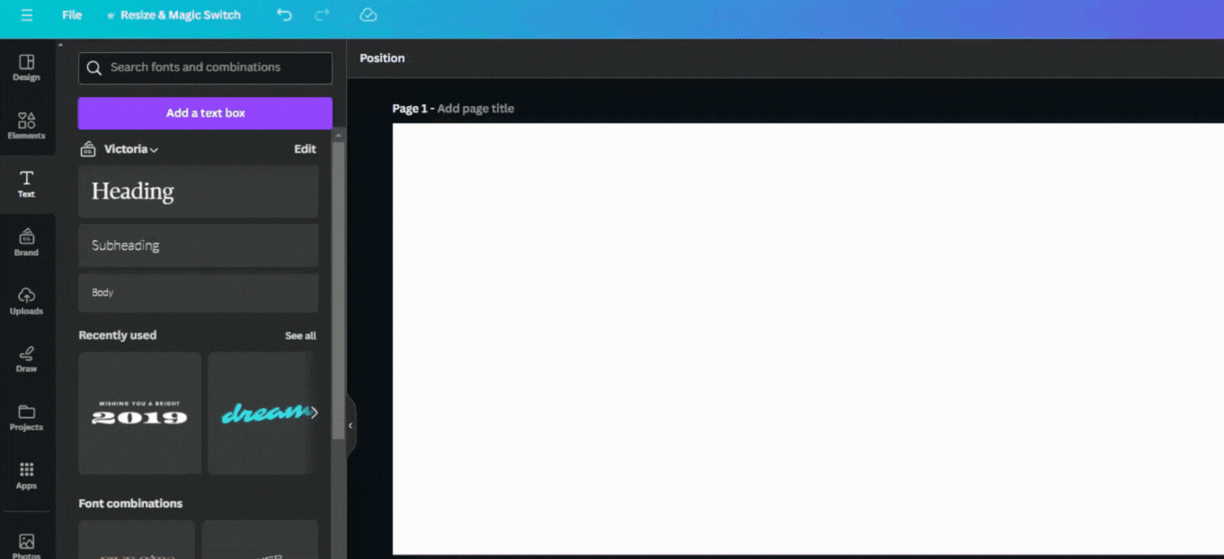
If you use Canva here’s how you can select a font style:
The perfect amount of fonts to pick is 3. Anything above that is too much.
The following tips mention social media but they will also apply to your website.
A common mistake people make on social media is using colors that don’t contrast well, making the text hard to read and leading to eye strain.
For example, while this might look pretty, it’s not very easy to read:

Especially when compared to the following:

So always make sure your content is easy to read. This not only keeps it looking great but also ensures that everyone, including people with visual impairments, can access and enjoy it.
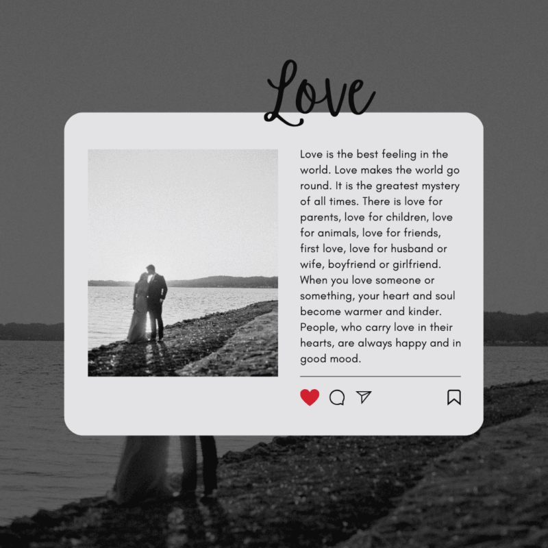
Let’s compare these two. This one is probably easier to read:
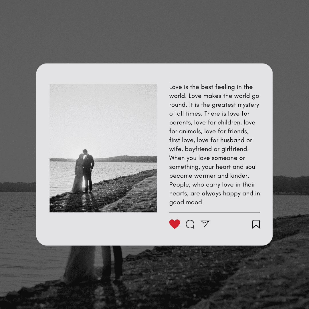
Compared to:
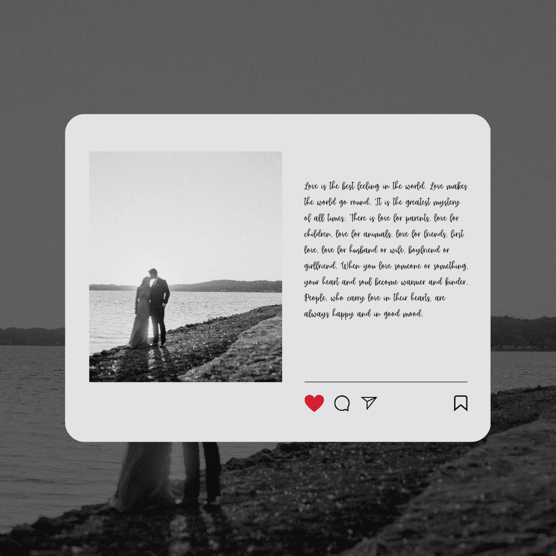
So when using long paragraph text on your website or social media, it’s important to choose something closer to the first image. If you choose to use a ‘script font’ or a cursive like the second image, it will be better to use it sparingly like so:
Book a Design Clarity Audit. I offer these for female entrepreneurs who need guidance or tips when creating their branding.
And if you enjoyed this post, don’t forget to share it with others!

%20(1).jpg)
This for the women who wear their hearts on their sleeves, lead with their values, and are bored to tears by "one-size-fits-all" business advice
Join me there. I create content to help make online visibility feel less like stepping on a stage and more like chatting with friends. That's also where I show all 67 sides of my personality and where I talk more about non-business topics because business doesn't happen in a vacuum and pretending it does is kinda weird.
Join me on threads
.jpg)